
Chart Patterns Explained for Beginners: Double Top, Head & Shoulders and Triangles
Chart patterns are repeating shapes a stock’s price draws on a chart — the double top, head and shoulders, and triangles are the most common. They matter because they are crowd psychology made visible: the same greed near highs and fear near lows, repeating across decades. For a long-term investor, reading them means timing a smarter entry — not day trading.
This is a detailed, beginner-friendly lesson. By the end you’ll be able to recognise each pattern on sight, understand exactly why it forms, know the four basics you need first (support, resistance, trendlines and volume), and follow a clear, repeatable checklist to actually use patterns in your own investing — without becoming a trader.
So what does a 1992 scam have to do with chart patterns? Almost everything. Zoom out on that boom and bust and it draws a single, unmistakable shape: a steep climb, a sharp peak, and a collapse — what chartists call a “blow-off top and reversal.” That shape is a chart pattern, just on the scale of an entire market. And it formed for one reason: human emotion. Greed pushed prices far above what the businesses were worth; fear yanked them back down. Every pattern in this lesson — the double top, the head and shoulders, the triangle — is that same tug-of-war between greed and fear, captured as a smaller shape on a single stock. Learn the shapes, and you’re really learning to read the crowd’s mood before the news makes it obvious.
What Are Chart Patterns, Really?
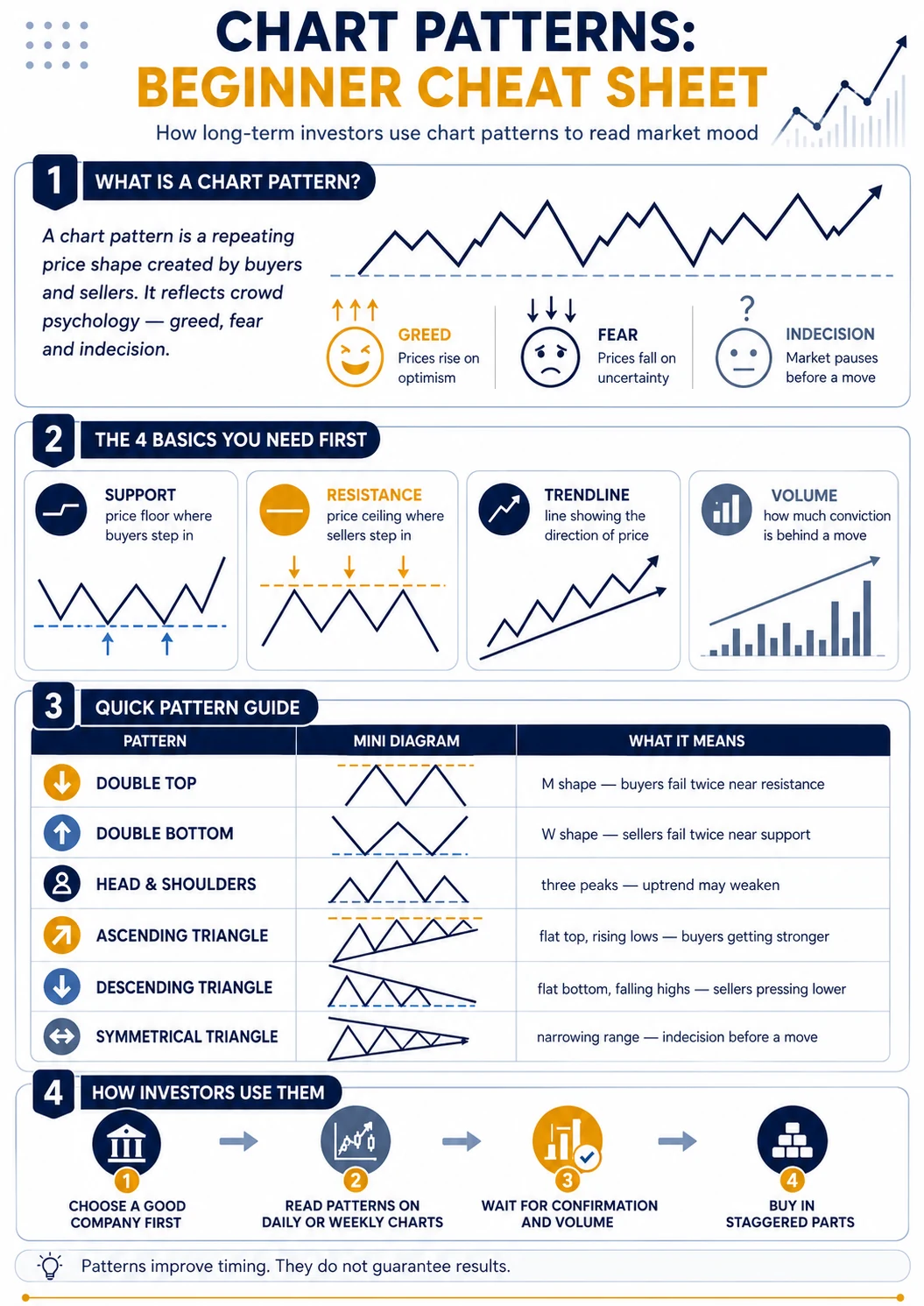
A chart pattern is a recognisable shape price forms as buyers and sellers fight over a stock — tops, bottoms and triangles that appear again and again. They repeat because human nature doesn’t change: crowds turn greedy near highs and fearful near lows in every generation. A pattern is simply that repeating emotion, drawn as a picture.
Think of a chart pattern the way a doctor reads an ECG. She isn’t predicting your exact future — she’s recognising a familiar rhythm and what it usually means. A stock chart does the same: it records the tug-of-war between buyers and sellers, and certain rhythms tend to repeat. Studying that price behaviour is technical analysis; studying the business itself — its profits, debt and growth — is fundamental analysis (Chapter 2). You need both, and patterns sit firmly on the technical side.
Underneath every pattern are just two forces. Support is a price level where buyers have repeatedly stepped in — think of it as a floor. Resistance is a level where sellers have repeatedly stepped in — a ceiling. A chart pattern is nothing more than support and resistance arranged into a shape your eye can recognise. That’s why you can’t truly read patterns until you can spot those two lines first.
Why this matters: patterns don’t work because of the shapes — they work (when they do) because human behaviour is stubbornly repetitive. The crowd includes big institutions too — Foreign Institutional Investors (FIIs) and Domestic Institutional Investors (DIIs), whose large orders often leave the clearest footprints on a chart. That same repetition is also why patterns fail: a shock no crowd saw coming can erase any pattern overnight.
Why Should a Long-Term Investor Care About Chart Patterns?
For a long-term investor, chart patterns are not buy-or-sell signals — they’re a mood-reading tool. Used well, they help you avoid buying into euphoria at a peak, notice when panic may be exhausting itself, and stagger your entry into a good company at a saner price. They add timing to a decision your fundamentals have already made.
Here’s the honest boundary this lesson respects: a pattern is the last 10% of a decision, never the first. If a company’s business is weak, no beautiful chart shape will save it. But once you’ve found a company you’d be happy to own for years, a pattern on a longer-term chart can stop you from overpaying in a moment of excitement — exactly the mistake the crowd made in 1992. This is not a trading guide. There are no intraday calls, no “buy now” signals, and no stock recommendations here.
Quick Reference: The Chart Pattern Cheat Sheet
Here is the whole lesson in one table — each pattern as a shape, a piece of crowd psychology, and a sensible investor response. Use it as a quick reference, then read the full sections below to understand why each pattern forms. Using a pattern you don’t understand is just guessing with a nicer picture.
| Pattern | Shape | What it may mean | What a long-term investor might do |
|---|---|---|---|
| Double Top | M | Buyers failed twice near resistance | Don’t chase the price up; wait for confirmation |
| Double Bottom | W | Sellers failed twice near support | Watch for a recovery to confirm before acting |
| Head & Shoulders | Three peaks | An uptrend may be weakening | Review why you own it; don’t panic-sell |
| Ascending Triangle | Flat top, rising lows | Buyers getting stronger | Wait for a breakout backed by volume |
| Descending Triangle | Flat bottom, falling highs | Sellers pressing lower | Be patient and cautious |
| Symmetrical Triangle | Narrowing range | Indecision before a move | Wait for the direction to reveal itself |
Before You Use Chart Patterns, Know This
Chart patterns are not the first thing you learn — they are built on four basics: support, resistance, trendlines and volume. Every pattern is just these arranged into a shape. If these words are new, learn them first; trying to read patterns without them is like reading sentences before you know the alphabet.
- Support — a price level where buyers keep stepping in (a floor).
- Resistance — a price level where sellers keep stepping in (a ceiling).
- Trendline — a straight line joining a run of higher lows (uptrend) or lower highs (downtrend); it shows the direction of the crowd.
- Volume — how many shares changed hands. A move on heavy volume is a crowd; on thin volume it’s a whisper. Volume is how you tell a real breakout from a fake one.
What Is a Double Top (and Double Bottom)?
A double top is an “M” shape: price rises to a high, pulls back, rallies to about the same high a second time, then fails and falls. It hints that buyers tried twice to break the ceiling and couldn’t — momentum is fading. A double bottom is the mirror “W”, hinting that selling pressure is drying up.
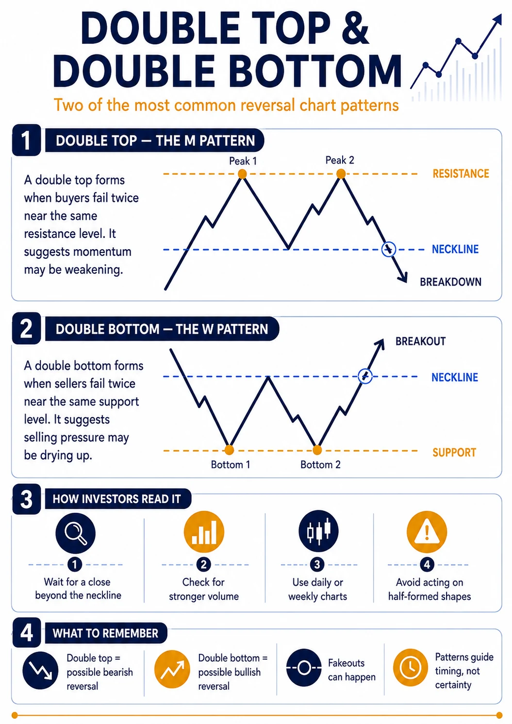
Picture the psychology. Price climbs to a level — say a ceiling near a round number — where sellers appear and push it back down to a support (the valley between the two humps). Buyers gather their courage and charge the ceiling again… and fail at the same spot. That second failure tells you the crowd’s conviction is spent. The line drawn across the valley low is the neckline: many investors only treat the pattern as real once price closes below that neckline. Until then, it’s just two bumps.
A worked, illustrative example (not a recommendation): a well-known FMCG stock climbs to ₹500, dips to ₹460, then rallies back to ₹500 and stalls. That second failure at ₹500 is the double top, and ₹460 is the neckline. Chartists get interested only if price later closes below ₹460. As a rough guide of how far it might fall, they take the height of the pattern (₹500 − ₹460 = ₹40) and project it below the neckline (₹460 − ₹40 = ₹420). Treat that ₹420 as a rough zone to watch, never a promise.
The double bottom (W) is the same story in reverse, after a fall: two failed attempts to push lower, hinting sellers are exhausted and buyers may be returning. Watch for the classic trap in both: price can poke just past the neckline and snap back — a “fakeout.” That’s why patient investors wait for a daily or weekly close beyond the neckline, not a brief intraday spike.
What Is the Head and Shoulders Pattern?
Head and shoulders is three peaks: a higher middle peak (the head) flanked by two lower peaks (the shoulders), all resting on a support line called the neckline. When price closes below the neckline, it suggests an uptrend is running out of strength. The inverse version — the same shape upside-down — hints a downtrend may be ending.
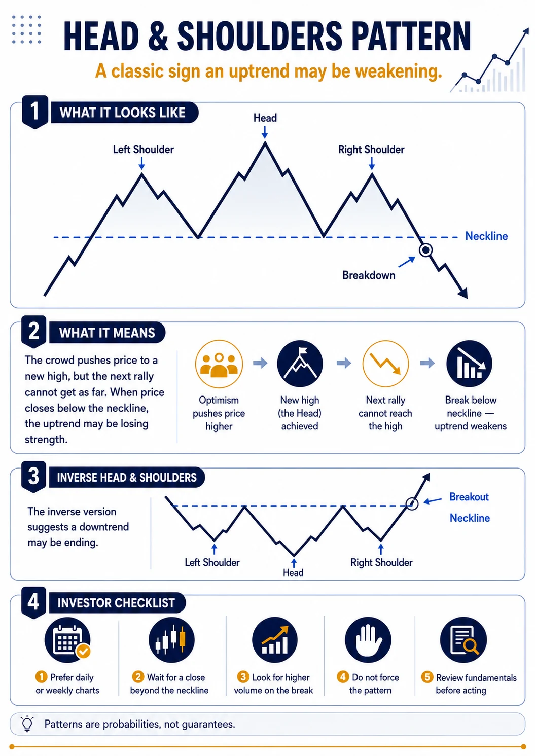
It reads like a clear emotional story. The crowd drives price to a new high (the left shoulder), pulls back, then pushes even higher (the head). The next rally can’t get as far (the right shoulder, roughly level with the left) — conviction is draining. The neckline joins the two valleys on either side of the head; a close below it is the signal chartists watch. As a rough downside guide, they measure the height from the head down to the neckline and project it below. For a long-term investor, a head and shoulders forming after a huge run-up is a nudge to slow down and re-check your reasons for owning — not a command to sell everything.
Two honest cautions: a “right shoulder” that pushes much higher than the left can invalidate the pattern, and the signal is far weaker without a volume pick-up on the neckline break. Textbook-neat head and shoulders are rarer than the internet suggests.
What Are Triangle Patterns (Ascending, Descending and Symmetrical)?
Triangles form when a stock’s price swings get narrower and narrower, coiling like a spring. An ascending triangle has a flat top and rising bottoms (buyers getting eager); a descending triangle has a flat bottom and falling tops (sellers in control); a symmetrical triangle narrows from both sides (a pause before the crowd decides). Triangles signal indecision, then resolution.
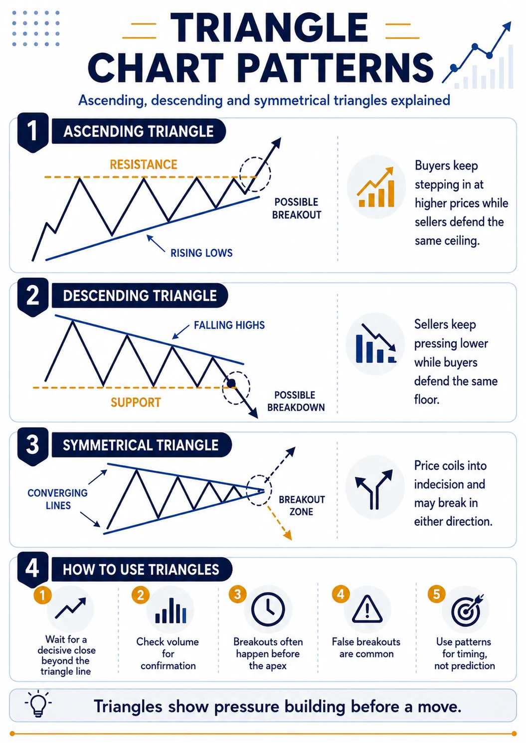
Each triangle tells you who is winning the tug-of-war. In an ascending triangle, sellers keep capping price at the same ceiling, but buyers step in a little higher each time — rising lows show growing appetite, and it often (not always) resolves upward. A descending triangle is the opposite: a firm floor with lower and lower highs, showing sellers grinding price down. A symmetrical triangle narrows from both sides — pure indecision that can break either way.
A triangle by itself doesn’t tell you the direction — it tells you a decision is coming, which is useful on its own: it says “pay attention and wait.” Patient investors let price close decisively beyond the triangle line on above-average volume before drawing any conclusion, because false breakouts are common. Note too that the move often happens before price reaches the tip (the “apex”) where the lines meet.
A Real Indian Example: What a Topping Pattern Looked Like
Real charts rarely draw textbook shapes, but the psychology is identical. After the Sensex peaked near 21,000 in January 2008, it rolled over and fell more than 60% through 2008 as the global financial crisis unfolded — a real, large-scale topping pattern. In March 2020 the opposite happened: a fast, fearful plunge that later formed a base and recovered over the following year.
Neither event was a tidy “M” or head and shoulders you could trace with a ruler — real markets are messier than diagrams. But they show the same truth the patterns teach: even the strongest uptrend can form a top when euphoria runs out, and the deepest panic can form a bottom when selling exhausts itself. The everyday double tops and triangles on individual stocks are just the smaller, more frequent versions of these turning points. (These are historical, educational references — not forecasts or recommendations.)
How Should a Long-Term Investor Actually Use Chart Patterns?
Use chart patterns as the last step of a decision, never the first. Decide what to buy using fundamentals; then use a pattern on a weekly or monthly chart to decide roughly when — confirming with volume, waiting for the pattern to complete, and buying in staggered parts. A pattern improves your odds; it never removes the risk.
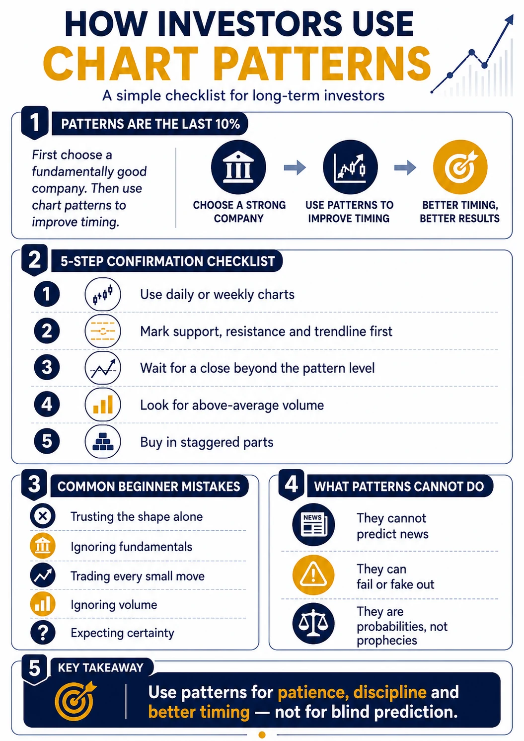
Before you act on any pattern, run it through this quick confirmation checklist. If you can’t answer “yes” to all five, wait:
- Is the pattern on a weekly or daily chart — not a 5-minute chart? (You’re an investor, not a trader.)
- Has price actually closed beyond the neckline or trendline — not just poked past it intraday?
- Is volume above average on the breakout, showing a real crowd behind the move?
- Is the company fundamentally acceptable to own for years, regardless of the chart?
- Am I planning to buy in staggered parts, not all at once?
Then follow the same disciplined sequence every time:
| Step | What to do | Why it helps |
|---|---|---|
| 1. Fundamentals first | Only apply patterns to a company you already want to own | A pretty chart can’t fix a weak business |
| 2. Zoom out | Read patterns on weekly or monthly charts, not intraday | Filters out daily noise; suits a long-term investor |
| 3. Check the basics | Mark support, resistance and the trendline first | The pattern is just these lines in a shape |
| 4. Wait for confirmation | Let price close beyond the neckline or triangle edge | Avoids acting on a half-formed shape or a fakeout |
| 5. Confirm with volume | Prefer moves backed by higher trading volume | A move with a crowd behind it is more believable |
| 6. Stagger your entry | Buy in parts, not all at once | One bad day won’t define your whole entry |
Put it together with our example. Suppose you’ve already decided, on fundamentals, that you’d like to own that FMCG company for the long term. On the weekly chart you spot a double top near ₹500 with the neckline at ₹460. You don’t act on the shape alone. You wait — and price closes below ₹460 on above-average volume, confirming the crowd’s enthusiasm has cooled. Instead of buying a falling knife, you note the rough ₹420 zone the pattern projects and, if the business still checks out, you buy in two or three staggered lots over the following weeks rather than one nervous click. You’ve used the pattern for timing and discipline — not as a prediction.
What Chart Patterns Cannot Do (Common Beginner Mistakes)
Chart patterns fail often. They can look textbook-perfect and still break the ‘wrong’ way, because no shape can see a surprise earnings result, an RBI rate decision, or global news. Patterns are probabilities, not prophecies. Treating one as a guarantee — or using patterns to jump in and out daily — is exactly how beginners lose money.
- Trusting the shape alone. A pattern with no fundamentals behind it is a guess with a nice outline.
- Forcing patterns. Look hard enough and you’ll “see” a head and shoulders in anything — that’s your brain, not the market.
- Ignoring volume. A breakout on thin volume often fizzles into a fakeout.
- Turning it into trading. Using patterns to buy and sell every week is a different, riskier game than investing.
- Expecting certainty. Even good patterns are right only some of the time — which is why owning quality businesses and staggering entries matters more than any single chart.
Glossary: Key Terms in This Lesson
| Term | Plain-English meaning |
|---|---|
| Chart pattern | A recurring shape price makes on a chart (e.g. double top) |
| Support | A price level where buyers have tended to step in (a floor) |
| Resistance | A price level where sellers have tended to step in (a ceiling) |
| Trendline | A line joining higher lows (uptrend) or lower highs (downtrend) |
| Neckline | The support/resistance line that confirms a pattern when broken |
| Breakout | When price moves decisively beyond a support or resistance line |
| Fakeout | A false breakout that quickly reverses back |
| Volume | The number of shares traded — a gauge of conviction behind a move |
| Apex | The tip where a triangle’s two converging lines meet |
| Technical analysis | Studying price and volume behaviour on charts |
| Fundamental analysis | Studying the business itself — profits, debt, growth |
| Sensex / SEBI / NSE | BSE’s benchmark index / the market regulator / National Stock Exchange |
What’s next in your learning path: What Is Technical Analysis? · Support and Resistance Explained · Candlestick Charts Explained · How to Analyse a Stock Before Investing
Frequently Asked Questions
Are chart patterns reliable?
Chart patterns are useful hints, not reliable predictions. They reflect crowd psychology that often repeats, so they can improve your odds — but any pattern can fail when unexpected news hits. Treat them as one input alongside a company’s fundamentals and volume, never as a guarantee of what price will do next.
Can chart patterns predict the stock market?
No pattern can predict the market with certainty. Patterns describe probabilities based on how crowds have behaved before, not the future. The 1992 Sensex peak looked unstoppable until it wasn’t. Use patterns to manage your timing and expectations, not to forecast exact prices or dates.
Should a beginner use chart patterns?
Beginners are better off learning fundamentals first, then support, resistance, trendlines and volume, and only then adding patterns as a timing aid. Chart patterns are easy to misread and easy to force. Start by owning quality businesses for the long term; use patterns to avoid overpaying, not to trade.
Which chart pattern is the most reliable?
There is no single ‘most reliable’ pattern — reliability depends on volume, the wider trend, and a confirmed close beyond the neckline. Head and shoulders and double tops are widely watched, but a confirmed break on strong volume matters far more than the pattern’s name. Reliability comes from discipline, not one magic shape.
Do chart patterns work for long-term investing?
Yes, when used narrowly. For long-term investors, patterns on weekly or monthly charts help time entries into already-chosen companies and avoid buying at euphoric peaks. They are a supporting tool for patience and better pricing — not a reason to trade frequently, which usually hurts long-term returns.
Key Takeaways
- Chart patterns are crowd psychology drawn as shapes — the same greed and fear that peaked in 1992 repeats in miniature every day.
- The three to know: the double top/bottom (M and W), the head and shoulders, and triangles (ascending, descending, symmetrical).
- Learn the basics first — support, resistance, trendlines and volume — because every pattern is just those in a shape.
- For investors, patterns are a timing and mood-reading tool: the last 10% of a decision, applied to companies you already want to own.
- Confirm with a close beyond the neckline on above-average volume, read longer timeframes, and stagger your entry. No pattern is a guarantee — this is patience with better information, not trading.
How we wrote this lesson: it combines documented Indian market history, standard technical-analysis concepts, and beginner-focused, illustrative examples. It is educational, not investment advice, and every historical figure is sourced below.
Sources & further reading: SEBI — About SEBI (statutory powers, 30 January 1992); NSE — History & Milestones (incorporated 1992, trading from 1994); NSDL (demat, 1996); pattern concepts — John J. Murphy, Technical Analysis of the Financial Markets; Investopedia — chart patterns. Background on 1992: 1992 Indian stock market scam (Wikipedia). For the 2008 and 2020 index examples: Stock market crashes in India (Wikipedia), with levels from BSE/NSE historical index data.
Disclaimer: This lesson is for educational purposes only and is not a recommendation to buy or sell any stock or security. Chart patterns are analytical tools, not guarantees; past patterns do not ensure future results. Company prices and index events are used as illustrative or historical examples. Please make your own decisions or consult a SEBI-registered investment adviser.